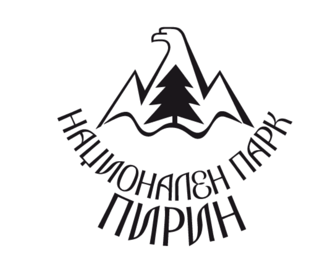
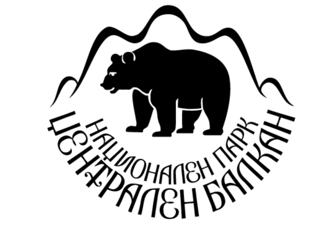
Inspired by the master in Bulgarian logo design and trademarks from the 20th century, Stefan Kanchev, I also took some inspiration from his own works on a very similar topic - designs for some of the other National parks in Bulgaria. More for this brilliant artist you can find here:
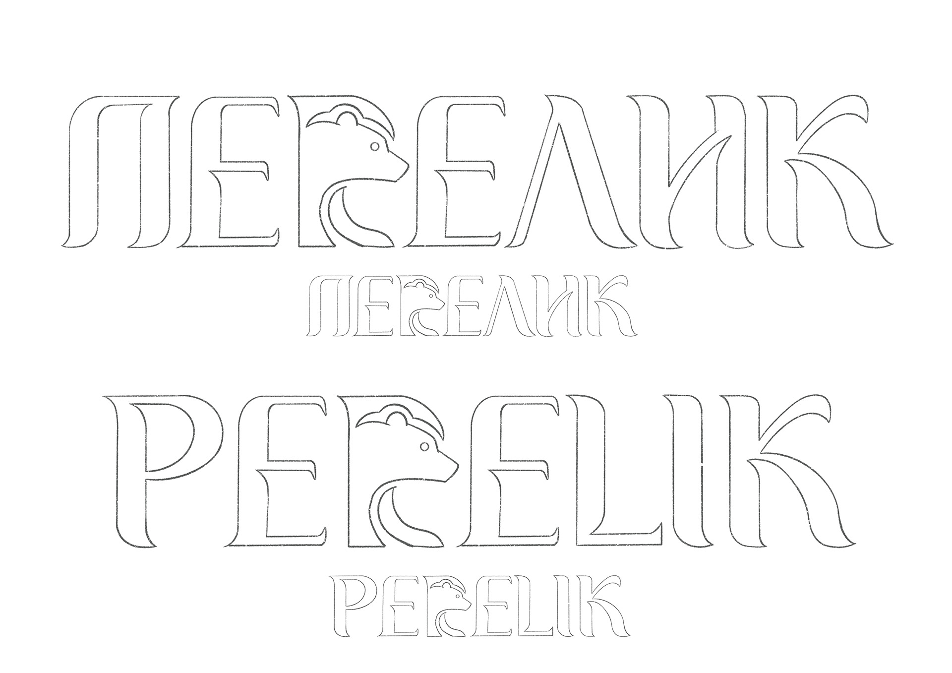
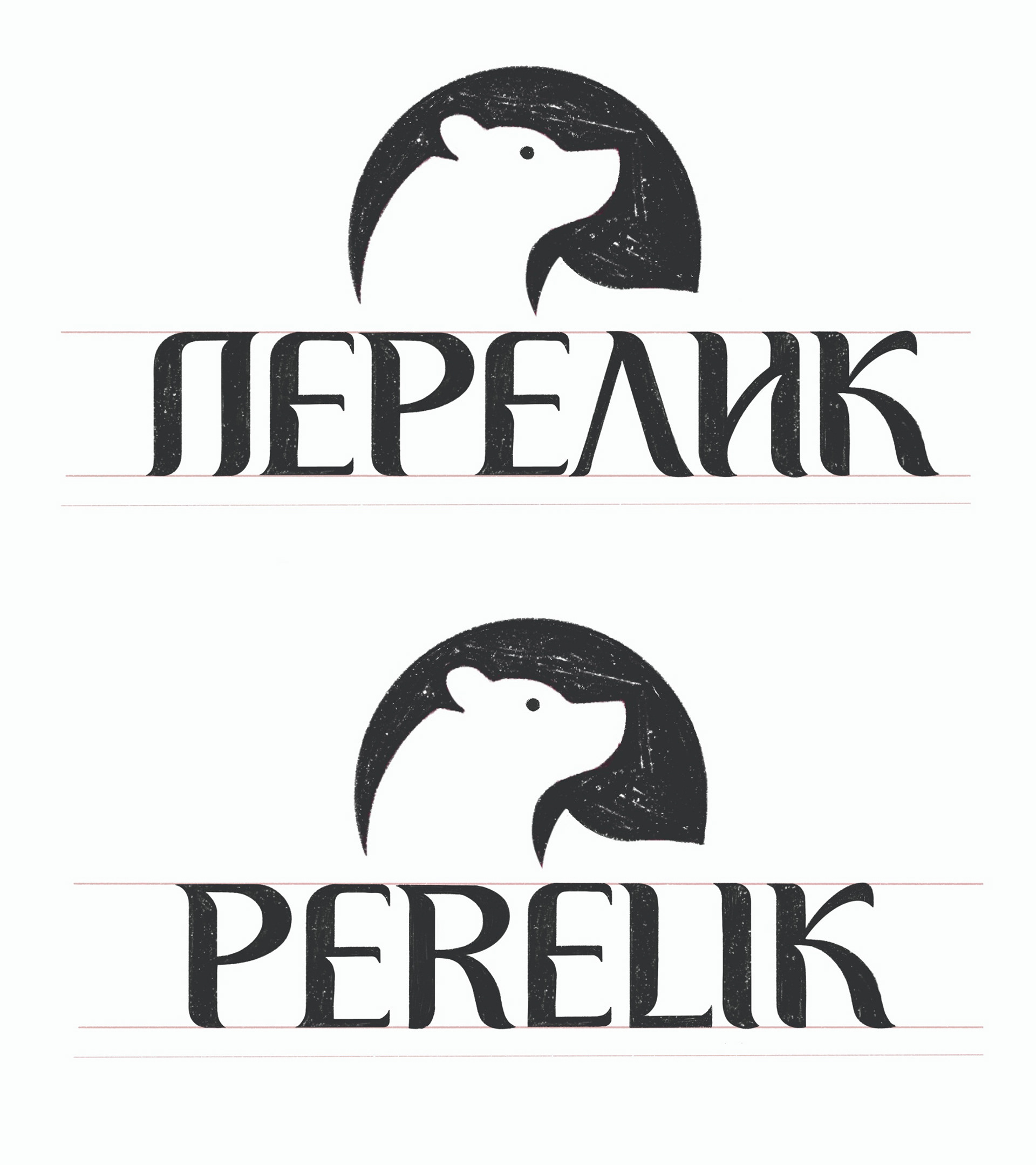
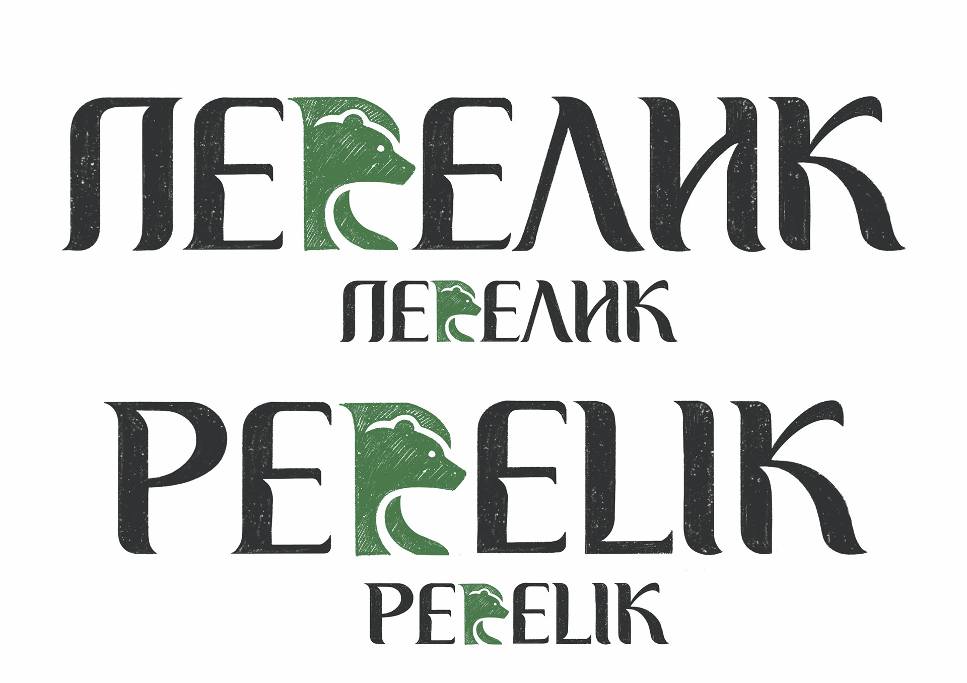
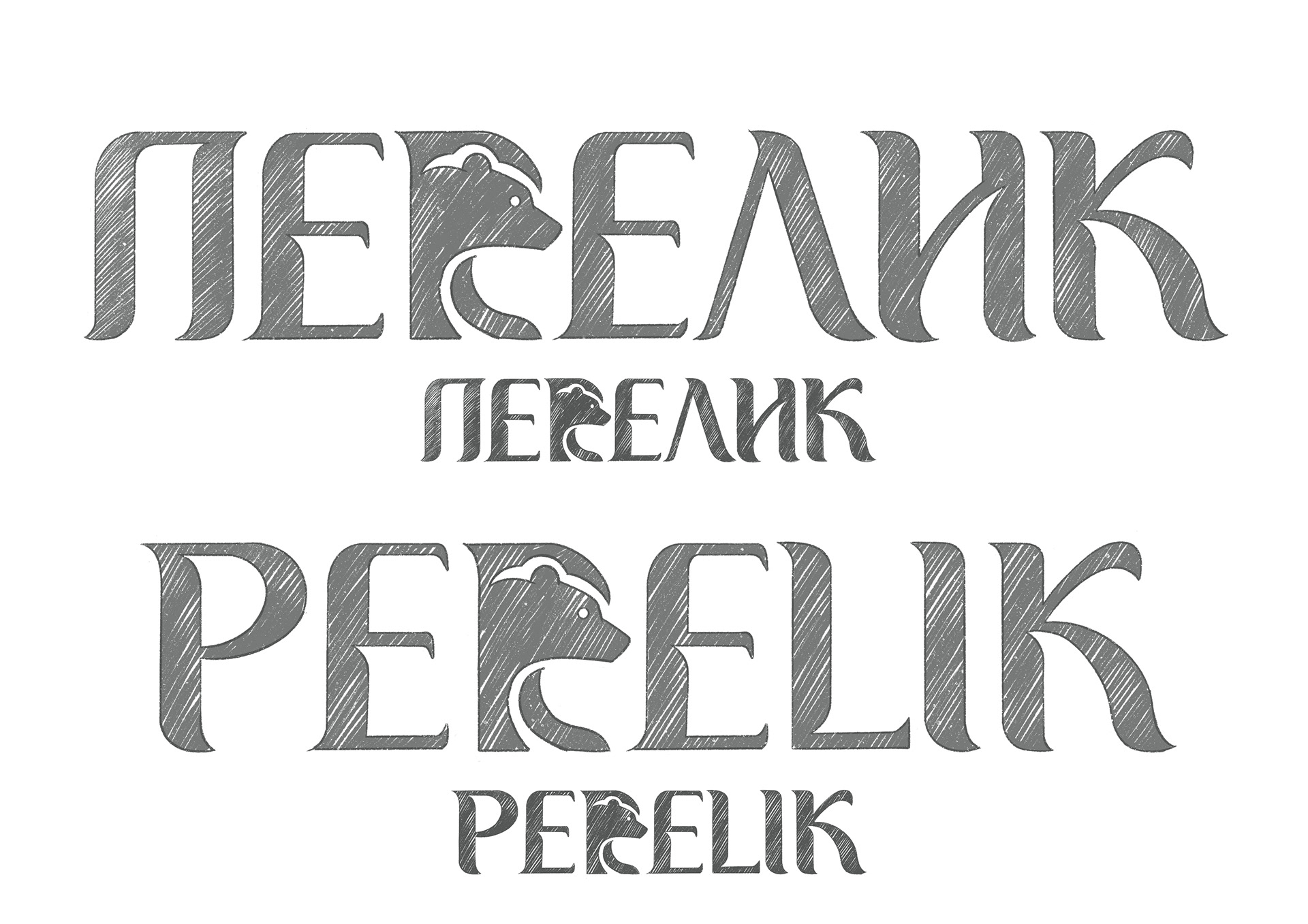
In the process of creation, a custom logotype was derived alongside an icon, both of which form a completed logo proposal that is characterised by high contrast, soft shapes and rounded edges. The letters are individually adjusted to each other for the greatest possible harmony between them. The work is executed in classical proportions, combined with some more modern ones, and it hopes to achieve a modern sound in the spirit of good typography practices.

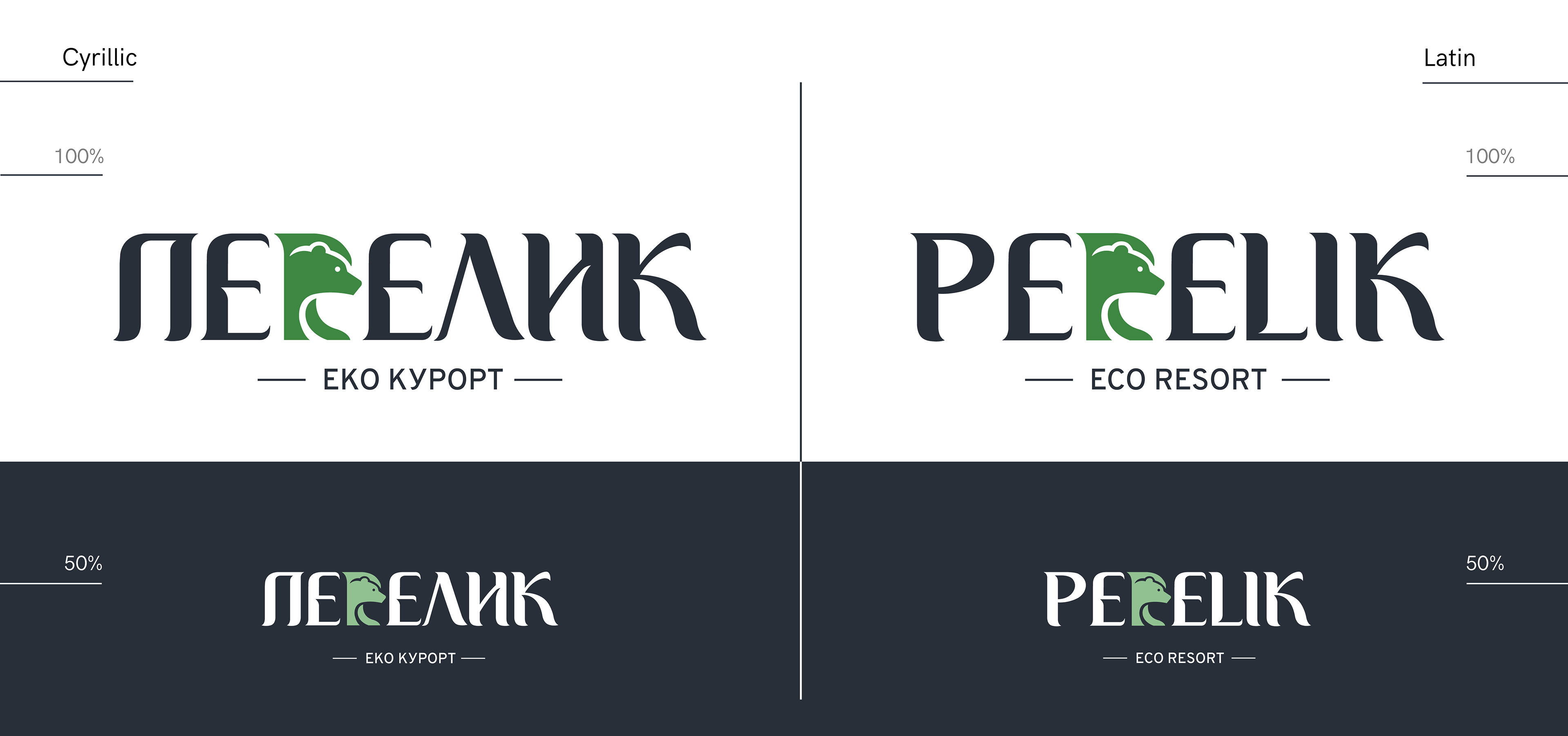
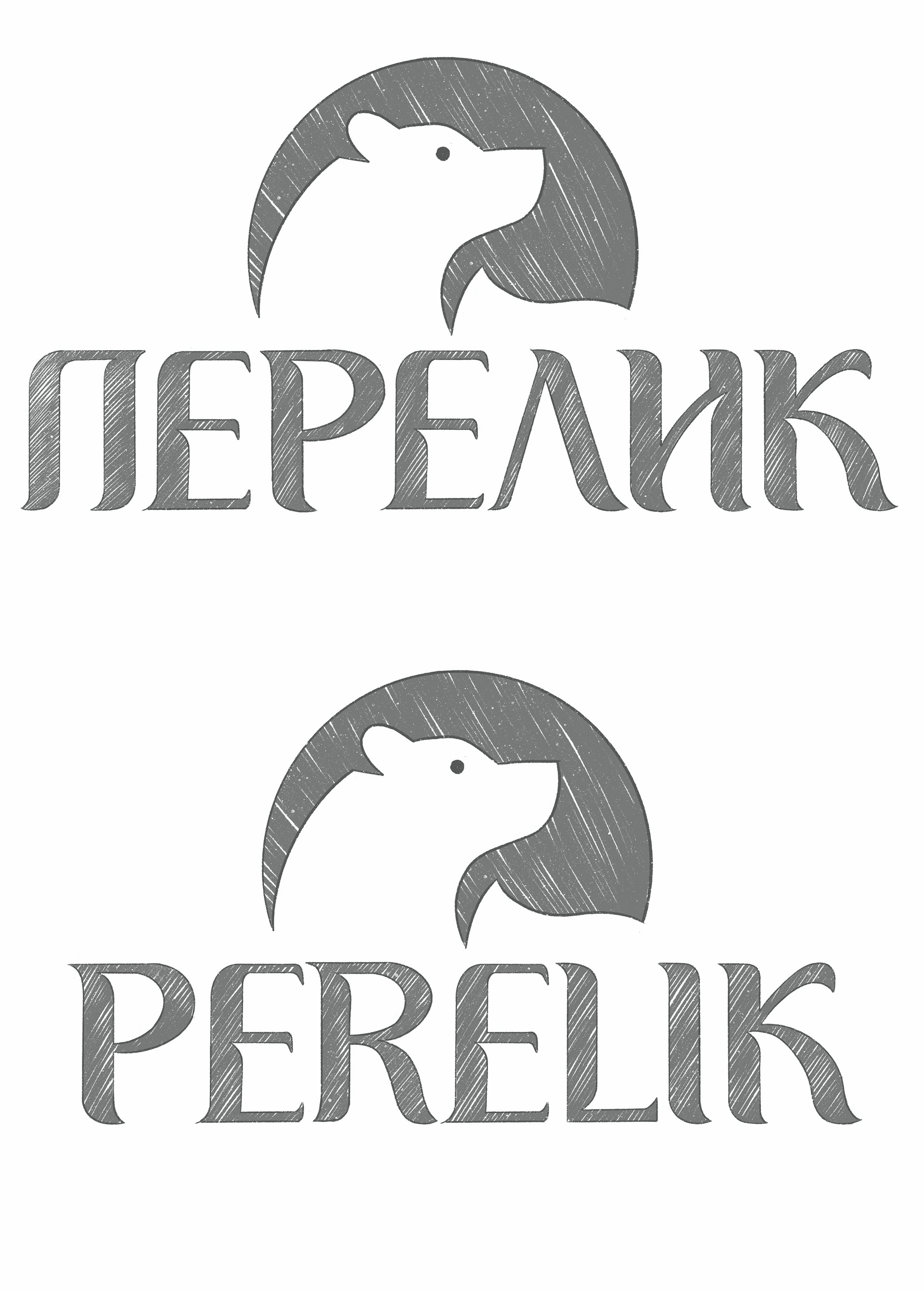
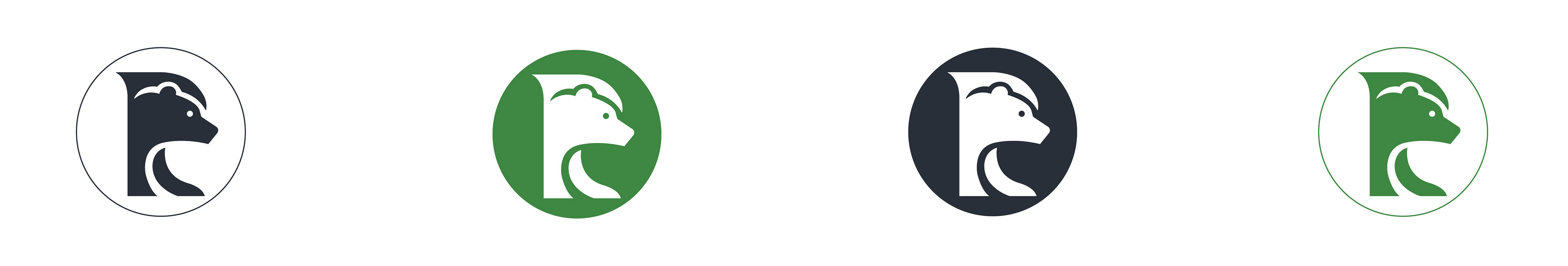
In the basis of the authorship of this proposal lies the interweaving of the symbol of the bear in the letter P (Cyrillic) and R (Latin), as well as the cuts in the letters that result from rounding and sharpening, giving a sense of both dimension and shadow, as well as certain uniqueness. The icon, integrated into the logo is also an integral part of it. In the stylised head of a bear with a paw, the same contrasting elements that characterise the font are sought. The symbol doesn't change for the Cyrillic and Latin variants, as in the Latin the movement of the paw also plays as a leg for the letter R, and this same "paw" in Cyrillic remains the same, to preserve the image of the bear.
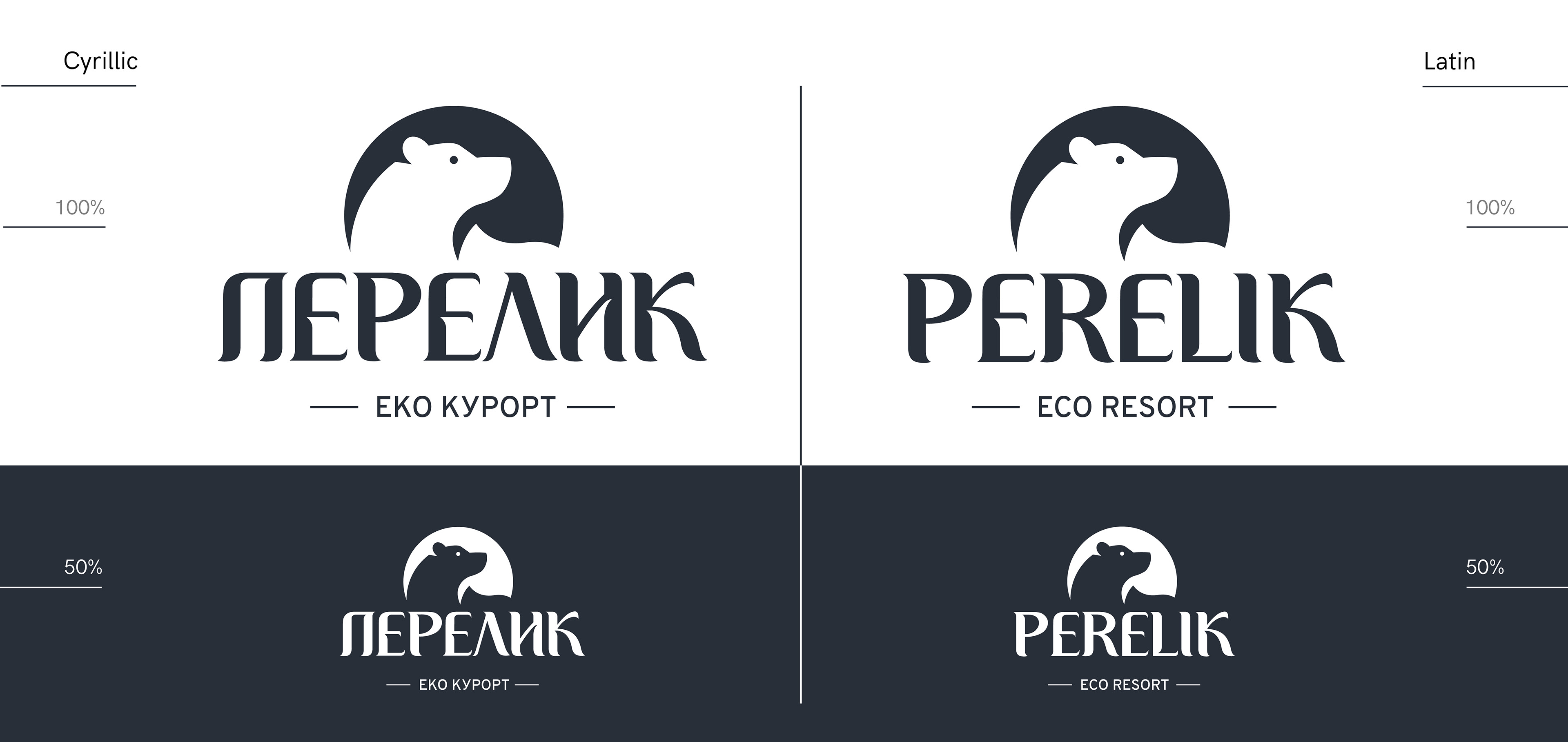
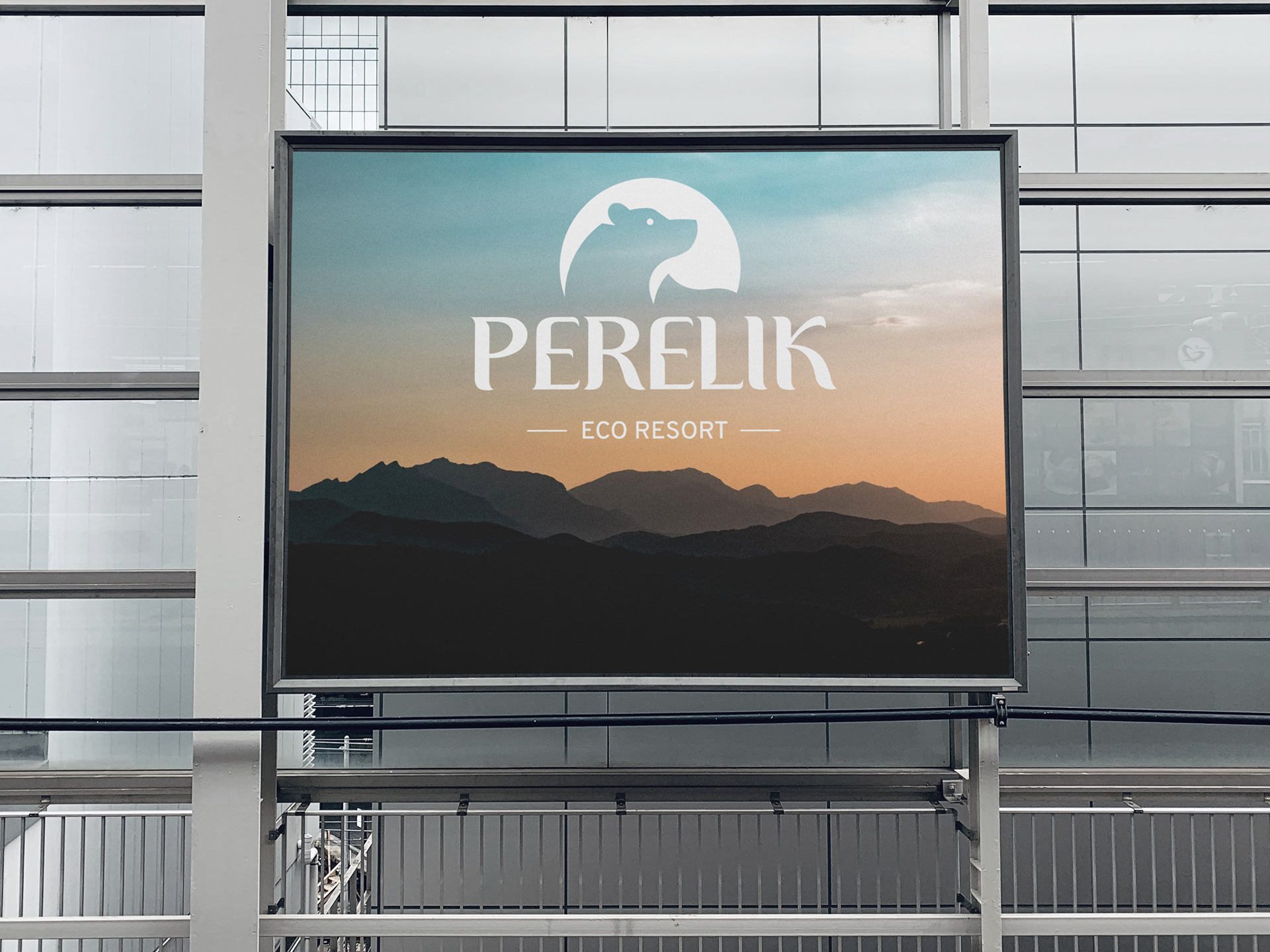
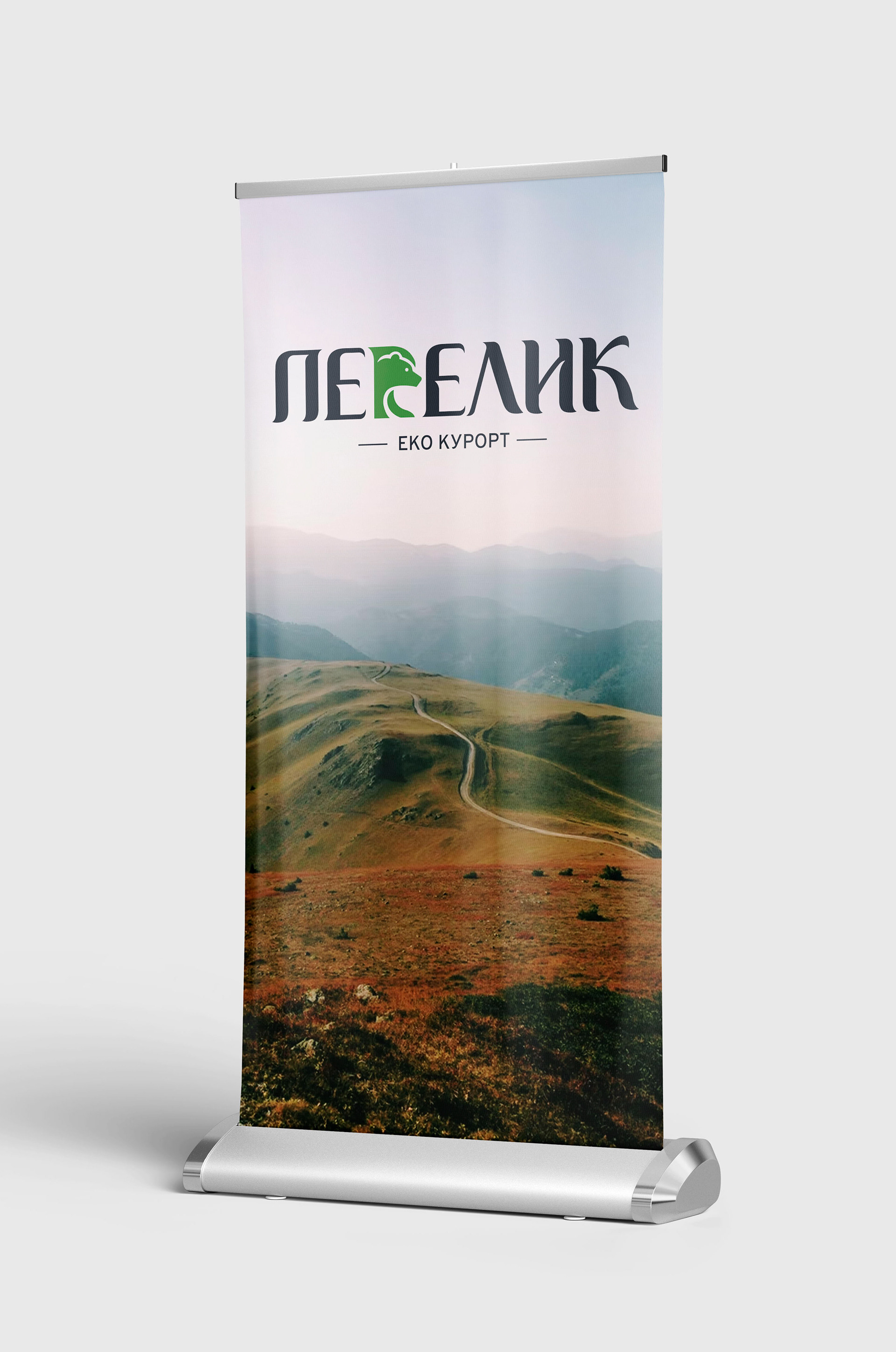
In this variant, the letters P (Cyrillic) and R (Latin) are part of the logo, and the icon is harmoniously positioned centrally above it. In this logotype, a stylistic consistency with the typography was sought, while again rounding and sharpening connect the two visual components. In this case, logotype and trademark can they exist independently, but they are also inseparable in their wholeness.


Thank you for taking the time to appreciate this project!