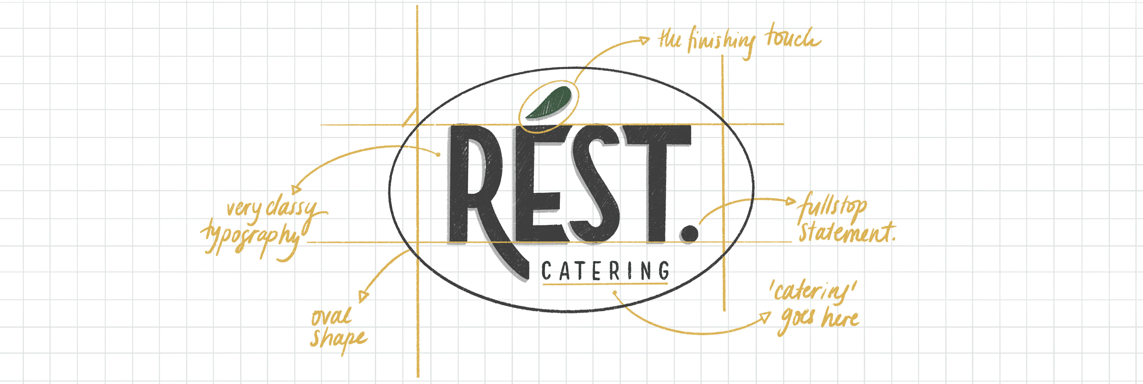
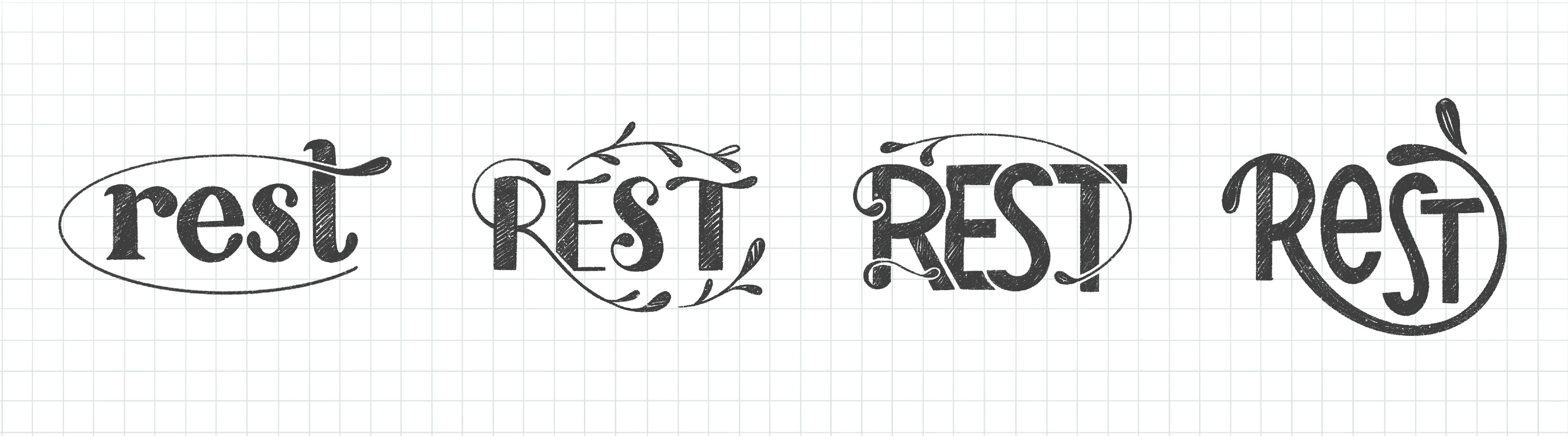
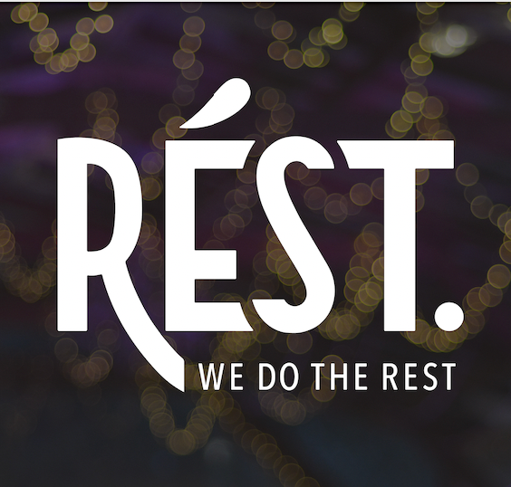
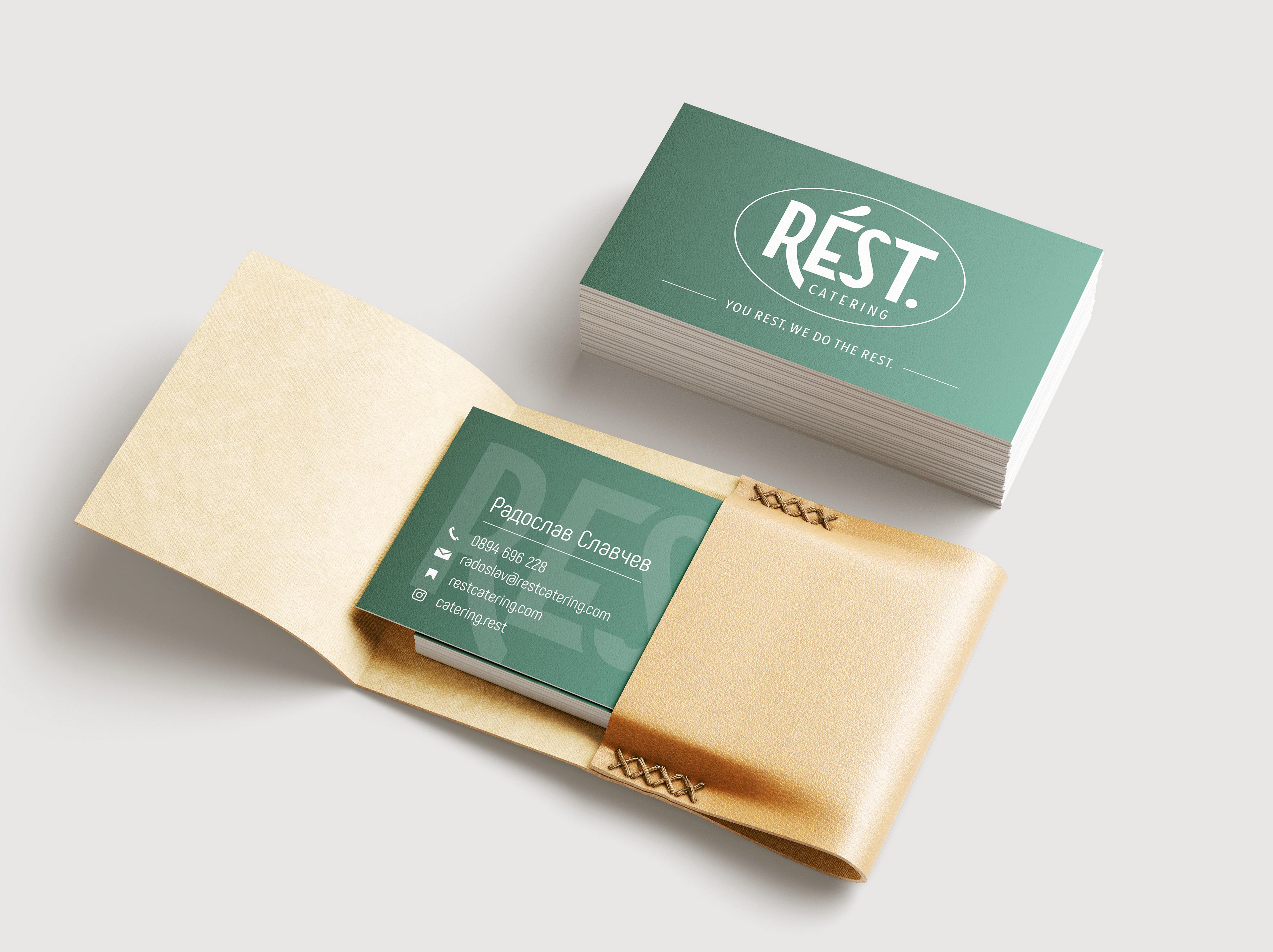
The first time when pen touched paper with a vague idea of this concept, it was close to the end of 2020. Here are some of the early sketches, where lied the hope to develop a logo which would bear in itself timelessness. Rést stands for many things, but overall it is a bold concept with a very delicate and fine touches. This is what the logo represents in a classical typography and clean shapes.

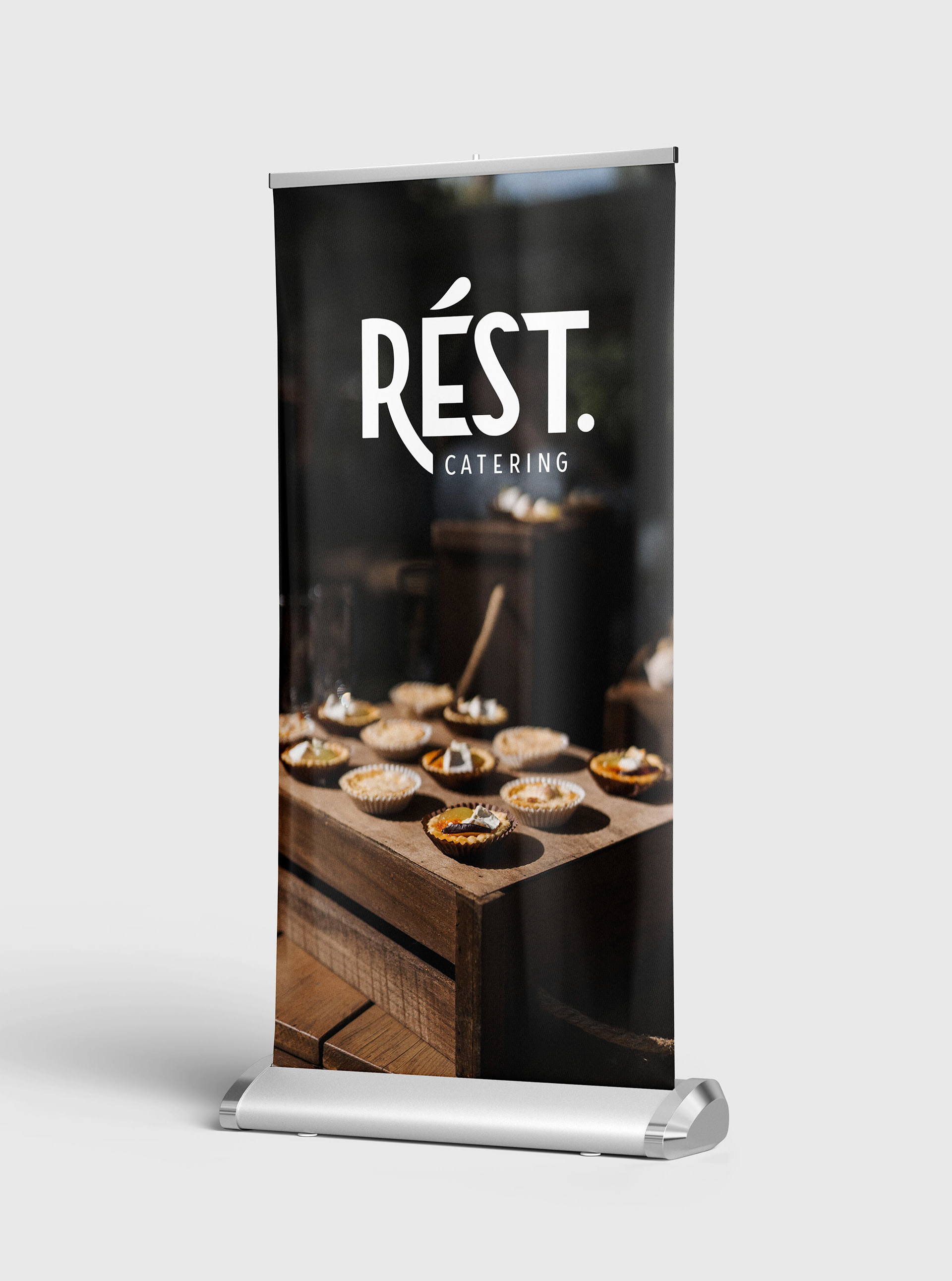
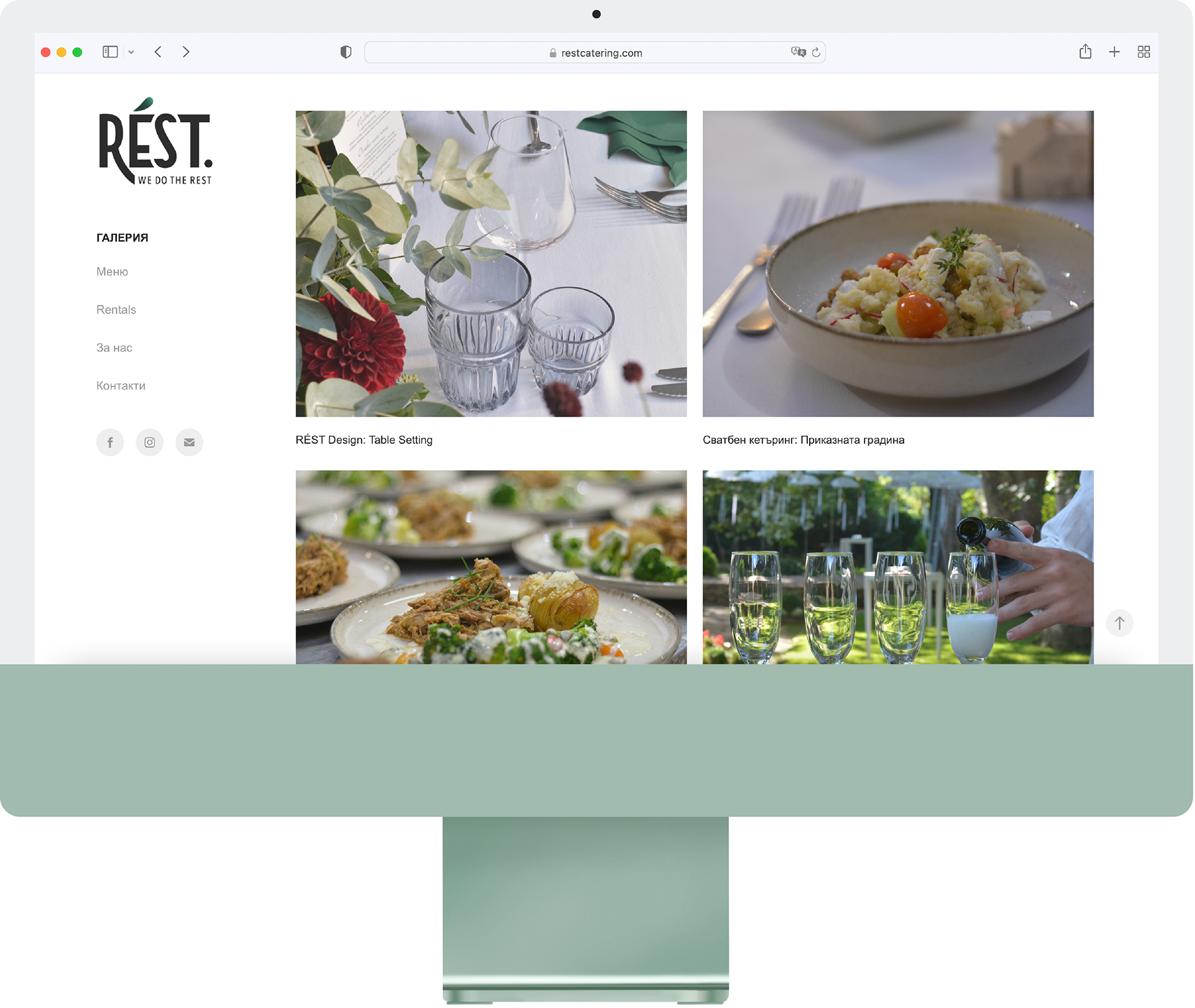
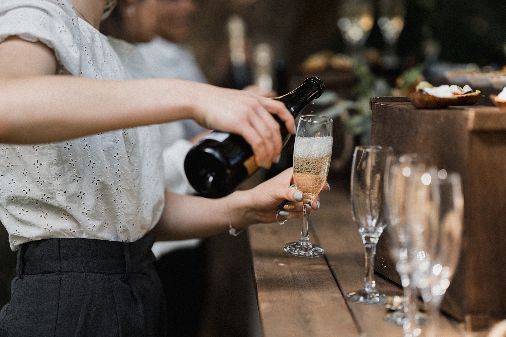
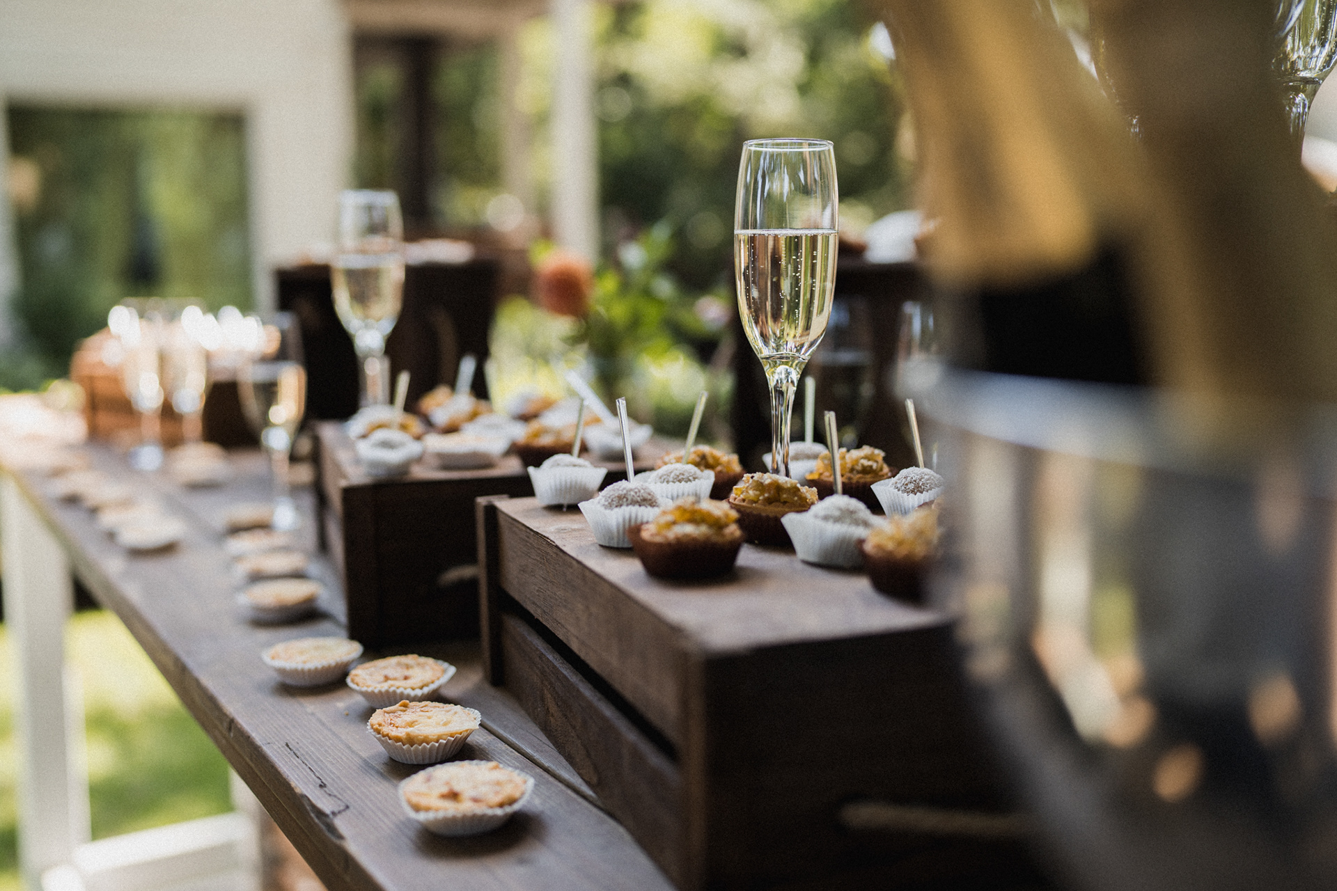
The website took a while, as a photography process had to be undertaken over a few months. Capturing events and emotions, editing and styling the pictures and maintaining some very simple and clean web design aesthetics. The focus is solely on the product and service, and the navigation hopes to take the viewer through the whole experience. Additionally an Instagram page was created, which you could view further down.